Beauty Tools Product Photography for Shopify
Beauty tools are genuinely one of the trickier product categories to photograph well for Shopify. You're dealing with a mix of hard reflective surfaces, ergonomic curves, chrome accents, LED indicators, and sometimes translucent materials, all in one product. A jade roller looks completely different from a facial steamer, which looks nothing like a set of makeup brushes. The range is wide, and the photography approach needs to shift accordingly.
The core challenge with Shopify specifically is that your main product image does a lot of heavy lifting. It appears in collection pages, search results, and social sharing previews. For beauty tools, a lazy white background shot is often not enough to communicate quality, size, or how the tool actually functions. Shoppers buying a gua sha stone or a microcurrent device want to feel confident in the texture, weight, and finish before they commit. Your images carry that entire burden.
Reflective surfaces are your biggest technical enemy. Stainless steel facial rollers, chrome curling irons, metallic derma rollers, all of these bounce back harsh light and create blown-out hotspots that erase detail and make products look cheap. The fix is controlling your light sources with diffusion panels, shooting in a light tent for smaller tools, or using cross-polarization techniques for items with aggressive gloss.
Size context is another common gap. A Shopify product page without a lifestyle or scale image forces the customer to rely entirely on written dimensions. For beauty tools, showing the product held in a hand, resting near a familiar object like a coffee mug or a standard bottle, or placed against a styled vanity gives an immediate sense of scale that text cannot replicate. This reduces returns and improves conversion meaningfully.
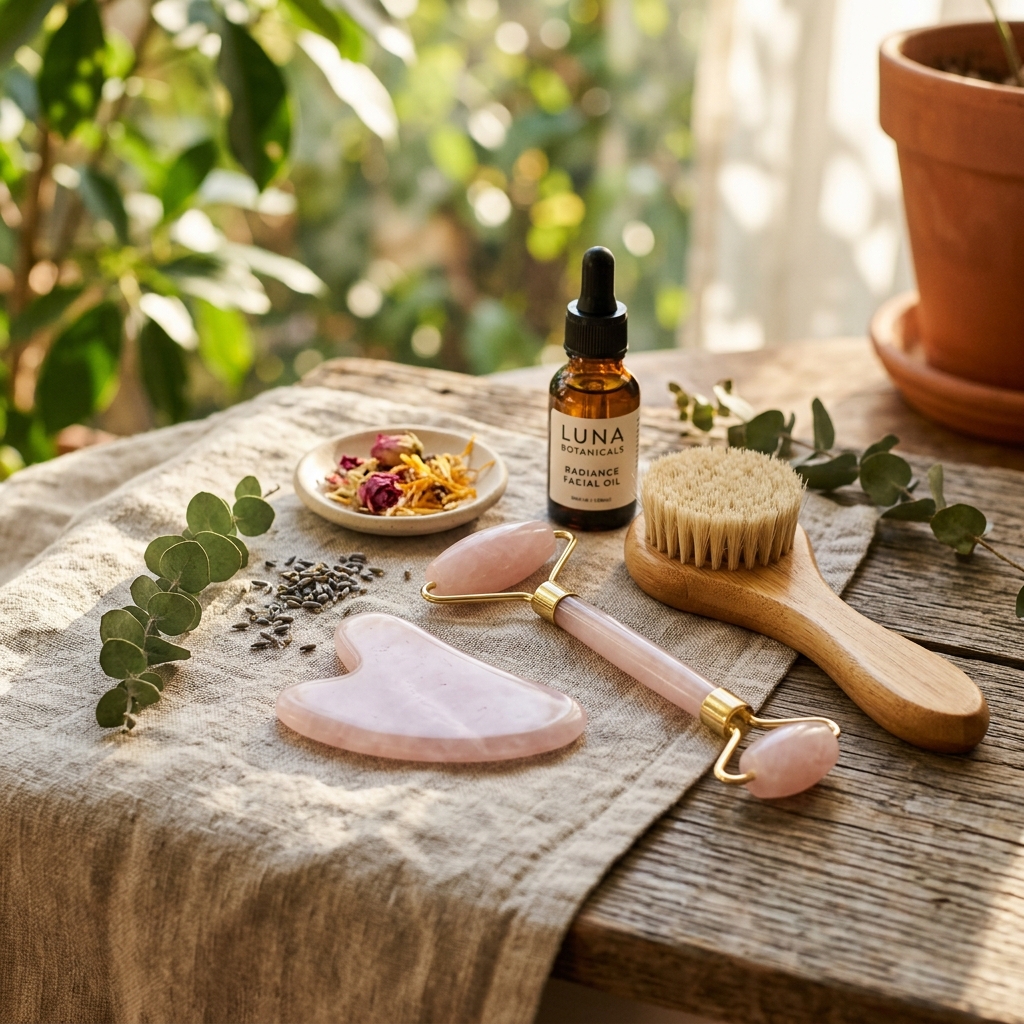
Finally, think about how your image gallery tells a story. Lead with a clean, well-lit hero shot on white or a light neutral background. Follow with a lifestyle image showing the tool in use or in a styled bathroom or vanity setting. Add a close-up that highlights the material, texture, or key feature like a bristle tip or charging port. End with a comparison or scale shot. That four-image structure covers the questions most beauty shoppers have before they scroll down to read the description.
Example Images
Common Mistakes
Shooting reflective beauty tools with bare flash or a single undiffused light source
Bare lights create harsh specular highlights on chrome, metal, and glossy plastic surfaces. These highlights wipe out the shape and detail of the product and make it look like a low-quality item even if it costs $150. The reflection also draws the eye away from the product's actual design.
Use a large softbox, a shoot-through umbrella, or a dedicated light tent for small tools. For very glossy surfaces like stainless steel facial rollers, try cross-polarization by placing a polarizing filter on your lens and one on your light source. Rotate the lens filter until the reflections disappear. It takes a few minutes to set up but the result is clean, detail-rich images you cannot get any other way.
Using a single white background image with no lifestyle or in-use shot
On Shopify, customers cannot touch or test a product. For beauty tools especially, a single flat product shot leaves major questions unanswered: How big is it? How does it feel to hold? What does it look like in a real setting? These unanswered questions create hesitation that kills conversions.
Add at least one lifestyle image per product. It does not need to be a full studio production. A model holding the tool near their face, or the tool resting on a marble tray with a candle and a small plant, costs almost nothing extra to produce if you batch your shoots. For tools with a strong functional story like microcurrent devices or LED masks, an in-use shot is essential.
Ignoring the Shopify thumbnail crop when composing images
Shopify collection pages display product images as square or portrait thumbnails depending on the theme. If your image has the product centered in a wide landscape frame, the thumbnail will crop out details or cut off parts of the product entirely. This makes your collection page look inconsistent and unprofessional.
Shoot with a consistent aspect ratio in mind, typically 1:1 square or 4:5 portrait. Center your product with breathing room on all sides. Check your specific Shopify theme's recommended image ratio before your shoot, and create a simple crop template in Photoshop or Lightroom that you apply to every image before uploading. Consistency across your collection grid builds visual trust immediately.
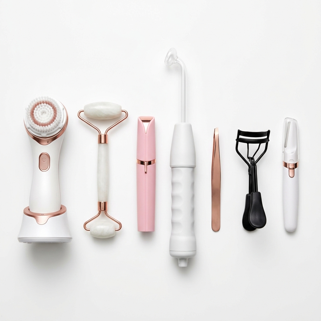
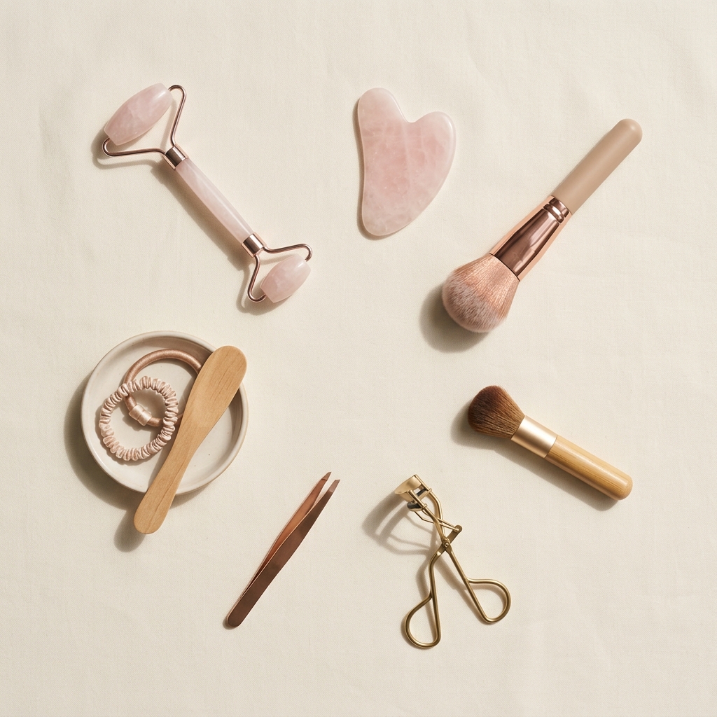
Photographing multi-piece beauty tool sets as a pile rather than a flat lay or arranged composition
When kits, brush sets, or tool collections are dumped into a pile or box and photographed, individual items get obscured, scale is unclear, and the overall value of the set is hard to read. Customers scroll past because they cannot see what they're actually getting.
Arrange sets in a flat lay with each item visible and evenly spaced. Use a foam board or small props to angle items slightly for dimension. Number items in a second image that matches a legend in your product description. This approach shows the full value of the set and reinforces the thoroughness you want customers to associate with your brand.
Skip the trial and error
Get Shopify-ready Beauty Tools photos without the guesswork
Upload one product photo. ProductScene generates a complete Shopify gallery — every image slot, correctly sized, styled for the platform.
Try free