Skincare Product Photography for Etsy: Real Advice
Skincare on Etsy is a brutal category to stand out in. You're competing against thousands of sellers, many of whom have decent products but terrible photos — and some who have mediocre products with gorgeous photos that outsell everyone. The photos win, almost every time. Here's what makes skincare photography on Etsy genuinely different from other platforms: buyers aren't just evaluating your product, they're evaluating whether they trust putting it on their face. That's a much higher bar. Your images need to communicate cleanliness, efficacy, and ingredient quality before a single word is read.
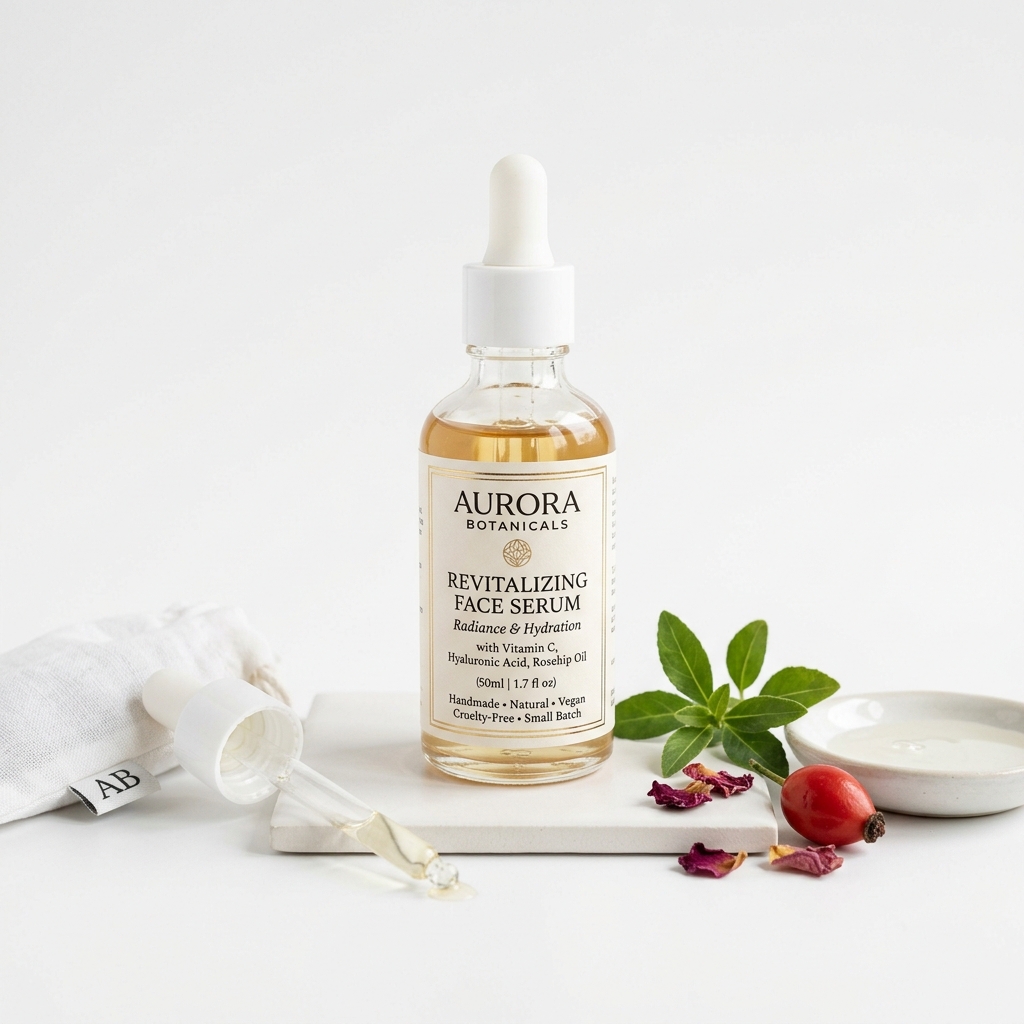
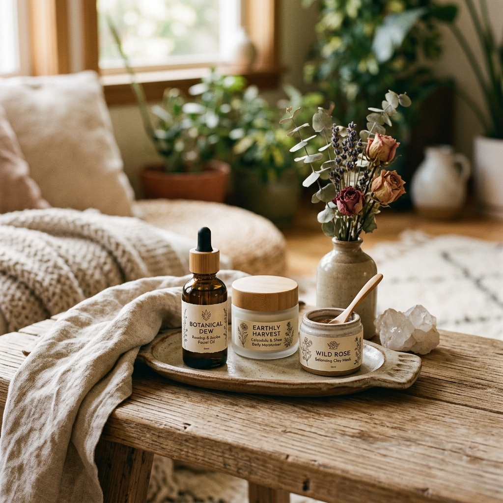
Etsy's audience skews toward handmade, natural, and indie brands, which actually works in your favor if you photograph accordingly. Forget the sterile white-box approach that works on Amazon. Etsy buyers respond to texture, warmth, and context. A facial oil photographed on a marble surface with a sprig of rosemary and warm side-lighting will outperform the same product shot on white seamless paper, every single time in this marketplace.
The specific challenges with skincare are real: products are often small, labels curve around containers making text illegible, glass bottles create reflections that blow out your highlights, and creams and serums are notoriously difficult to show in a way that communicates their texture without looking messy. Clear packaging — a nightmare for photographers — is extremely common in skincare. You need to think deliberately about backgrounds, light sources, and styling to make translucent bottles read as premium rather than empty.
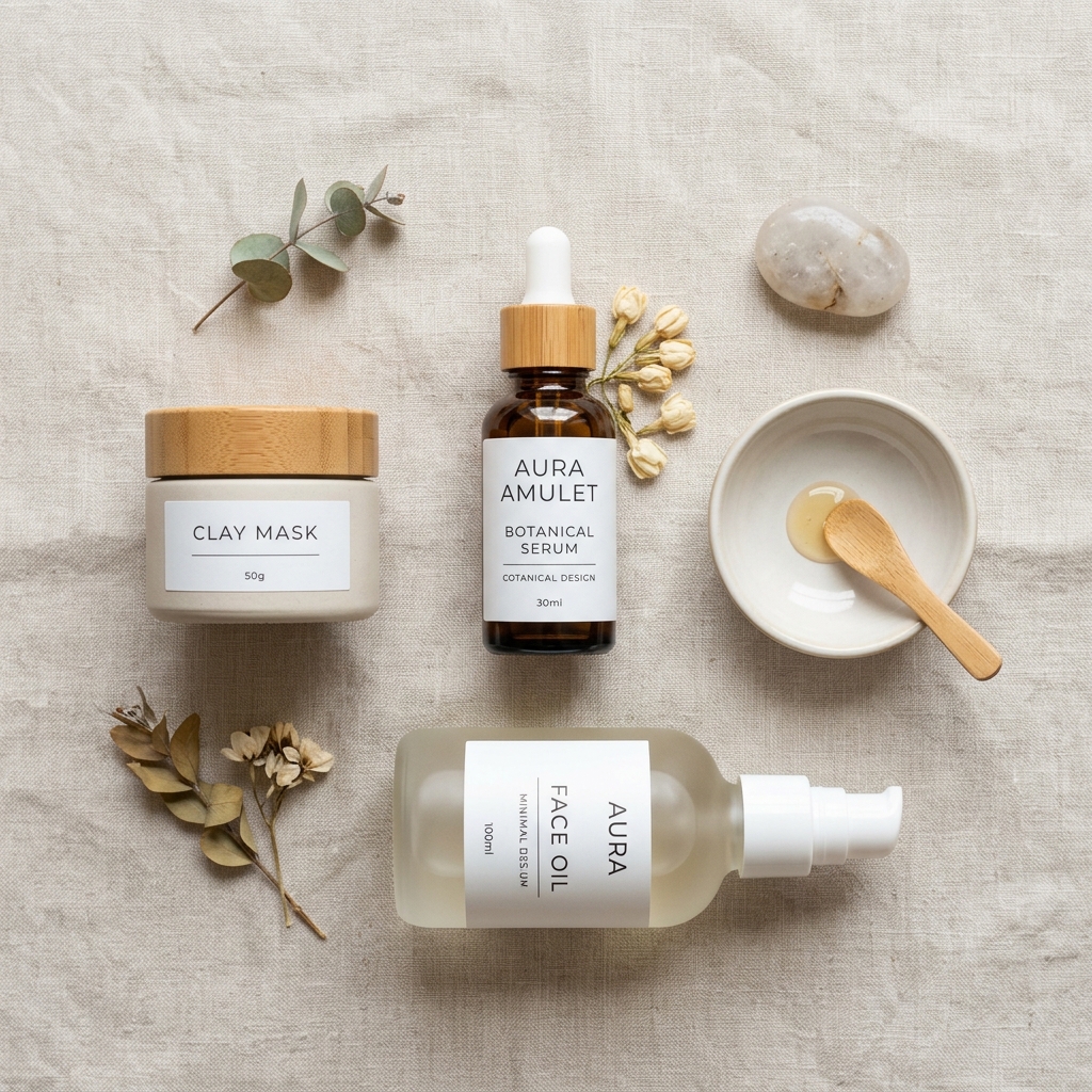
Etsy also gives you ten image slots. Most skincare sellers waste at least six of them. Every slot should be working hard — showing scale, texture close-ups, ingredient callouts, before-and-after context, or lifestyle shots that help buyers picture the product in their own bathroom routine.
Example Images
Common Mistakes
Shooting labels that can't be read
Skincare buyers want to know what's in the product and who made it. If your label wraps around a cylinder and you shoot it straight-on, half your brand name and ingredient list disappears into the curve. Buyers can't read it, don't trust it, and scroll past.
Shoot cylindrical products at a slight angle — typically 15 to 30 degrees off-center — so the key text on the label sits flat to the camera. For very curved containers, shoot two label shots: one showing the front panel clearly, one showing the back with your ingredient list. Flatten label photography in post if needed, but getting the angle right in-camera saves you hours of editing.
Ignoring texture and consistency shots
One of the biggest purchase barriers for skincare is not knowing how a product actually feels or applies. Is the moisturizer thick or lightweight? Does the serum feel greasy? Buyers are making a sensory decision from a static image. Most sellers just photograph the closed container and call it done.
Add at least one shot showing a small amount of the product applied to clean skin — the back of a hand works well and keeps things professional. For creams and balms, a small scoop on a spatula or your fingertip shows consistency instantly. For oils and serums, a drop on a surface catches light beautifully and communicates the texture far better than any closed bottle shot ever could.
Using flat overhead lighting that kills depth
Skincare products live and die on perceived quality, and flat lighting makes everything look cheap. Overhead softbox or ring-light setups eliminate shadows entirely, which means your glass bottle looks like a cartoon, your cream looks like white paint, and your packaging loses all its dimension. It looks like a product catalog from 2009.
Move your key light to the side — 45 degrees is a solid starting point, then adjust based on your specific product. Side lighting creates shadows that give containers shape and depth, makes cream textures look rich rather than flat, and causes glass and liquids to pick up beautiful highlights. A simple piece of white foam board opposite your light source acts as a cheap reflector to fill in shadows without killing them entirely.
Inconsistent styling across the shop
Etsy buyers often land on a single listing but then look at your shop as a whole before purchasing. If each product is photographed with a different background, different lighting style, and different props, your shop looks disorganized and amateurish — even if each individual photo is decent. It signals that you're a one-person operation without a brand identity, which kills trust in a category where trust is everything.
Pick two or three hero surfaces — a specific marble tile, a linen fabric, a particular painted wood board — and shoot your entire product line on those same surfaces. Keep your prop palette tight: three or four recurring elements like dried botanicals, a specific ceramic dish, or consistent glassware. This takes discipline but it transforms your shop from a collection of random photos into a cohesive brand that looks intentional and trustworthy.
Skip the trial and error
Get Etsy-ready Skincare photos without the guesswork
Upload one product photo. ProductScene generates a complete Etsy gallery — every image slot, correctly sized, styled for the platform.
Try free