Stationery Photography Tips for Etsy — Sell More Cards & Paper
Stationery is one of those categories on Etsy where the photography does almost all the selling. Buyers can't touch the paper weight, feel the ink texture, or smell that fresh print smell — your images have to bridge that gap completely. And the competition is brutal. Search 'greeting cards' or 'wedding invitations' on Etsy and you're looking at hundreds of thousands of listings. The shops consistently cleaning up are the ones with images that stop the scroll.
The core challenge with stationery photography is that paper is flat, often white or light-colored, and tends to either blow out in bright light or go muddy in soft light. Getting accurate color on a cream cardstock versus a bright white is genuinely tricky, especially when buyers are making purchasing decisions based on whether something matches their wedding palette or brand colors. A card that looks warm ivory on screen but arrives looking yellow is a return waiting to happen — and a bad review.
For Etsy specifically, you're working within a square thumbnail format that gets viewed mostly on mobile. That means your hero shot needs to communicate the product clearly at a tiny size before anyone even clicks through. Lifestyle shots matter here more than most categories — stationery buyers are aspirational purchasers. They're imagining the card on someone's mantle, the planner on their desk, the invitation suite laid out at their venue. Your job is to sell that vision before they read a single word of your listing description.
You also need to show scale, paper quality, and any special finishes like foil, letterpress, or vellum overlays — all things that are genuinely hard to photograph but absolutely critical for justifying your price point against cheaper mass-produced alternatives.
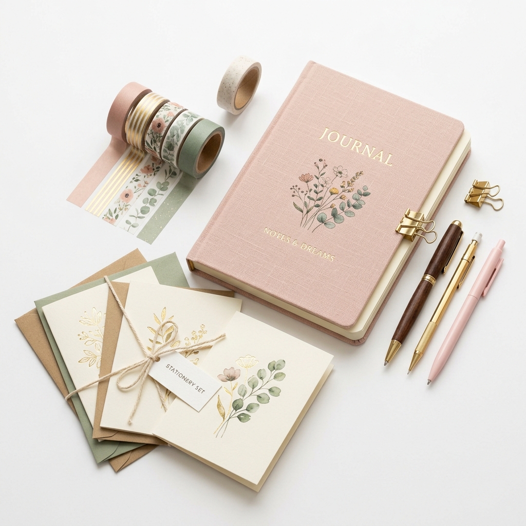
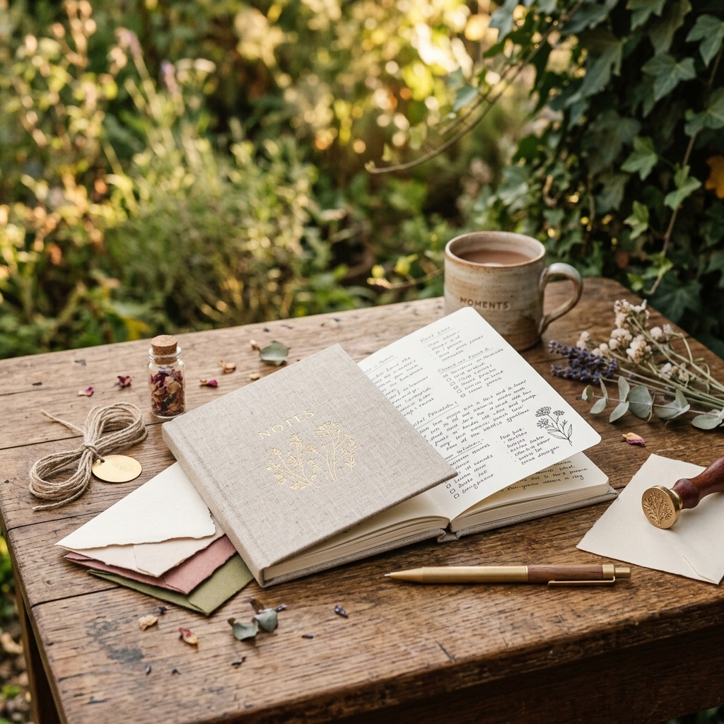
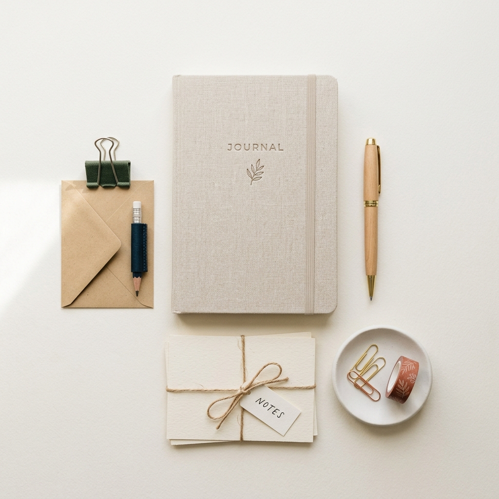
Example Images
Common Mistakes
Shooting on a plain white background for every single image
White on white is a nightmare to expose correctly and makes stationery look clinical and flat. It also gives buyers zero context for how the piece actually looks in real life, which increases purchase hesitation. Most importantly, every other budget seller is doing the same thing, so you look undifferentiated.
Use textured neutral backgrounds — linen, marble, raw wood, aged paper — that complement your brand aesthetic. Save the clean white background for one technical shot that shows the product clearly, and use lifestyle surfaces for your hero and secondary images. A $15 piece of marble contact paper from a hardware store transforms product shots instantly.
Not showing the inside of cards or the back of stationery pieces
Buyers are constantly disappointed when they receive a product and the inside is blank white when they assumed it would be printed, or vice versa. This leads to negative reviews and refund requests. Etsy's algorithm also rewards listings with multiple high-quality images, so leaving slots empty wastes ranking potential.
Always photograph the inside of folded cards, the back of postcards, envelope liners if included, and any detail shots of special finishes or paper texture. Use all 10 image slots. Even a simple shot of a blank card interior staged with a pen and coffee cup tells a useful story.
Inconsistent or inaccurate color representation across the listing
Stationery buyers — especially wedding customers — are color-matching to other elements. If your blush pink looks salmon on screen, you'll get returns and complaints. Inconsistent white balance across images in the same listing also looks unprofessional and erodes trust.
Shoot everything in the same lighting setup, shoot tethered to a monitor if possible, and always do a calibration shot with a grey card. In post-processing, adjust to a real-life reference — hold the actual product next to your monitor when editing. Consider adding a note in your photos showing the actual Pantone or hex color reference if color accuracy is critical to your buyers.
Ignoring the thumbnail crop when composing shots
Etsy displays a square crop of your first image in search results, and it's small. A beautifully composed wide landscape photo can become a blurry unrecognizable mess in the thumbnail, meaning nobody clicks through regardless of how good the full image is.
Compose your hero shot with the square format in mind. Center your main product with enough breathing room on all sides to survive the crop. Test your image by uploading it and viewing the listing in an incognito browser on your phone before publishing. If you can't tell what the product is at thumbnail size, reshoot.
Skip the trial and error
Get Etsy-ready Stationery photos without the guesswork
Upload one product photo. ProductScene generates a complete Etsy gallery — every image slot, correctly sized, styled for the platform.
Try free